Over the past several weeks, Spark! team members have been completing an accessibility training course to better understand how we can update and build content that is available to all.
Long story short: we learned a lot! And there’s so much more we can all be doing to increase the accessibility of our content (website included) for everyone.
According to the World Wide Web Consortium (W3C), “web accessibility means that websites, tools, and technologies are designed and developed so that people with disabilities can use them.”
1This makes it possible for people to perceive, navigate, understand, and interact with the internet whether they have disabilities affecting auditory, cognitive, neurological, physical, speech, and visual functioning.
Here’s a statistic that surprised us the most: 97.4% of online websites failed the WCAG 2 test, an assessment and guideline used to evaluate a website’s general accessibility. Additionally, 26% of home page images were missing alternative text for screen readers despite 59.6% of the U.S. disability population having internet access.
We wanted to share a few of the ignitable insights (Hey! That’s the name of the newsletter!) we think could inform decisions that benefit the communities you serve, too.
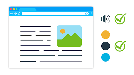
Visually impaired folks often rely on screen readers to relay the content of a web page, and there are a number of hidden variables that affect the way these tools see the page.
Alternative text. How does a screen reader read a photo? Well, it doesn’t really. Web designers embed alternative text into the back end of the website, almost like a hidden caption, that provides screen readers with the appropriate description of an image. If an image on your website is lacking alternative text, it may as well not exist to the visually impaired.
Color schemes. Similarly, the color scheme you choose for your website and marketing materials has implications far beyond the general aesthetics of your brand. Do you have blue and yellow together anywhere on your website? People with tritanopia color blindness2, for example, often confuse blue with green and yellow with violet. To them, your brand doesn’t say University of Michigan football, it says Barney the Dinosaur.
These are just a couple of examples, the tip of the iceberg, of adjustments companies could make to increase the accessibility of their websites and reach larger audiences.
Perhaps the most significant learning moment of these training sessions was the reminder that even when we’re doing all we can to be inclusive and equal, there is always room for improvement. We don’t know what we don’t know, and we never will unless we take the time to understand ourselves, others, and combine our efforts to create a better world.
At Spark!, we call this Human-Centered YOUnity™, and we use this philosophy to guide everything we do. We lead leaders to fulfill their potential, but even so we are constantly learning new things and striving to improve the way we interact with the world we share.
Empty space, drag to resize
1 Introduction to Web Accessibility | Web Accessibility Initiative (WAI). (n.d.). W3C. Retrieved September 9, 2022, from https://www.w3.org/WAI/fundamentals/accessibility-intro/#what
2 Colorblindness-Tritanopia | Hereditary Ocular Diseases. (n.d.). A Database of Genetic Eye Diseases | Hereditary Ocular Diseases. Retrieved September 9, 2022, from https://disorders.eyes.arizona.edu/handouts/colorblindness-tritanopia